
Blog Post 0
Data visualization of the Palmer Penguins data set clustered by species, mainly via the seaborn library. Two general relations are considered: Culmen Length vs Culmen Depth, and Flipper Length vs Body Mass.
0. Readin Dataset
First, readin the palmer penguins dataset through the url:
import pandas as pd
url = "https://raw.githubusercontent.com/PhilChodrow/PIC16B/master/datasets/palmer_penguins.csv"
penguins = pd.read_csv(url)
Inside the dataset, there are several entries that are interesting for visualization. I choose Culmen Length vs Culmen Depth, and Flipper Length vs Body Mass.
1. Culmen Length - Culmen Depth Relation
Now, try to visualize the general relation between Culmen Length and Culmen Depth of palmer penguins via a general scatter plot. The seaborn library contains a function named scatterplot for us to plot scatter plots, where data is the dataframe, x and y are the variables on x and y axis.
import seaborn as sns
sns.scatterplot(
    data = penguins,
    x = 'Culmen Length (mm)',
    y = 'Culmen Depth (mm)'
)
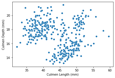
As visualized from the plot, it seemed that in general, there is a positive correlation between Culmen Length and Culmen Depth, and the data points are somehow separated into different regions via some features. Therefore, still trying to plot the result with different species via the seaborn function scatterplot, but this time, add another line to specify that the data points should be separated (via color) by penguins species, and the command ‘hue’ could do that:
sns.scatterplot(
    data = penguins,
    x = 'Culmen Length (mm)',
    y = 'Culmen Depth (mm)',
    hue = 'Species'
)
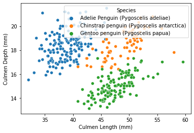
Through the result above, it seemed that penguin species is a nice feature of separating and clustering the data in this plot. Specifically, compared to Chinstrap penguins at the same level (controlled factors), Adelie penguins tends to have a lower culmen length, and Gentoo penguins tends to have a lower culmen depth.
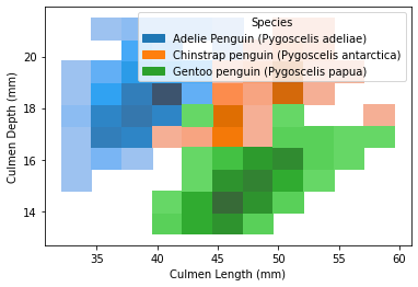
Similarly, can visualize this finding via a histogram. The seaborn library contains a function named histplot for us to plot histograms, where data is the dataframe, x and y are the variables on x and y axis, and hue here refers to the species separator.
sns.histplot(
    data = penguins,
    x = 'Culmen Length (mm)',
    y = 'Culmen Depth (mm)',
    hue = 'Species'
)
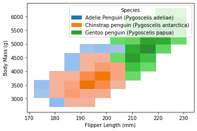
2. Flipper Length - Body Mass Relation
Now, try to visualize the general relation between Flipper Length and Body Mass of palmer penguins separated by species through a general scatter plot, which, similar as part 1, is made through by seaborn.scatterplot function:
sns.scatterplot(
    data = penguins,
    x = 'Flipper Length (mm)',
    y = 'Body Mass (g)',
    hue = 'Species'
)
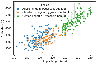
As visualized from the content, it seemed that Gentoo is clustered out from the other two species, by its generally higher body mass as well as flipper length.
The same result could also be visualized through a histogram via seaborn.histplot:
sns.histplot(
    data = penguins,
    x = 'Flipper Length (mm)',
    y = 'Body Mass (g)',
    hue = 'Species'
)
This is the end of this blog post! :)
I learned something really cool from my peer feedback!
I gave one of my peers a cool suggestion!